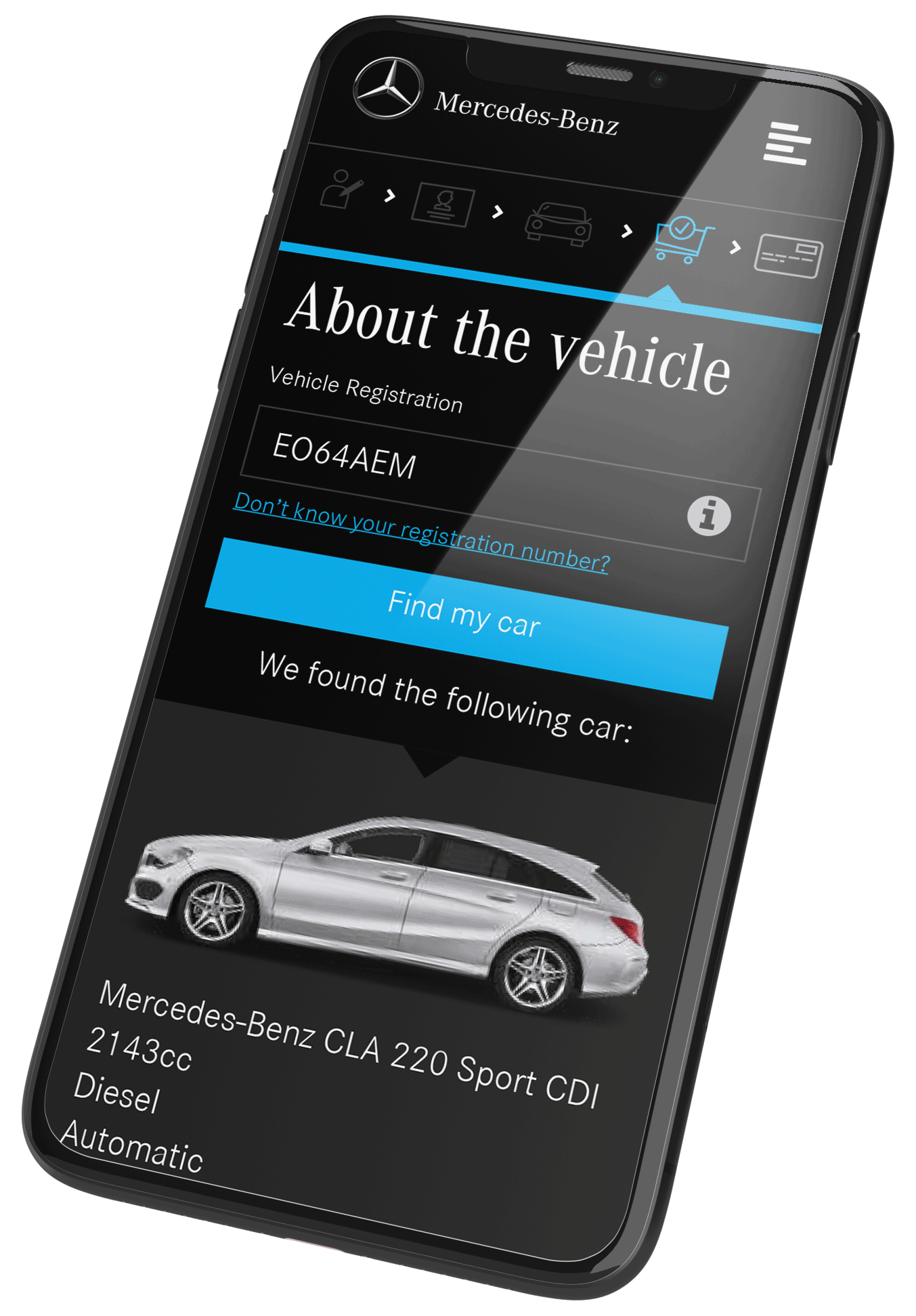
Mercedes-Benz Insurance products are traditionally sold via motor dealerships to the end customer. Our brief was to design a multi-platform, e-commerce solution to enable Mercedes-Benz to sell direct to the consumer in a non-advised online scenario.
The Challenge
Dealers are regulated by strict Financial Conduct Authority (FCA) guidelines when selling to customers on-site to ensure that they are treated fairly.
Our challenge was to navigate these sometimes complex regulations whilst ensuring a pleasurable, easy-to-use e-commerce experience.
The application also had to support multiple front-ends for the different brands within the Daimler Group. The Smart brand has quite a different tone to Maybach’s, for example!
A mobile first approach was taken to meet the constraints and demands of today’s landscape and work outwards in terms of screen real estate, content and functionality. Adopting a mobile first philosophy forces us to focus and prioritize more effectively and helped the client appreciate content priority and visual hierarchy during the process.
The Solution
Mapping the User Experience
To add a further level of complexity, our solution had to integrate with an existing business to business platform, engineered to support an ‘advised sale’. We needed to fully understand this user experience and compliance requirement in order to align, divert and compensate where necessary for a ‘non-advised’ online scenario.
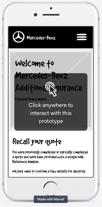
Low-Fi prototyping and the help of our friends at Marvel, enabled us to quickly iterate and test our user journeys with clickable prototypes. Early visualisation of the experience was extremely beneficial to the team, raising usability and compliance issues face-on at the outset.
MVP v0.6.1
The latest ‘Minimum Viable Product’ (MVP) for early release
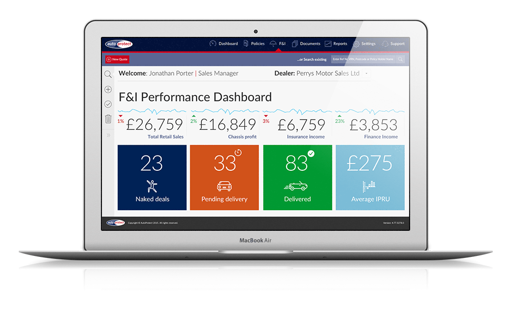
AutoProtect make it easy for automotive dealers and manufacturers to sell their insurance products across the globe through a technology platform they have developed called ‘AutoProcess’. This drives all client support applications, delivering powerful transactional and reporting functionalities and insightful information about sales force performance, product monthly sales figures, revenue totals and more. AutoProcess was in it’s second iteration when we were invited to examine the core platform UX, along with it’s client support apps.
Autoprotect have a fantastic 25 strong team of full-stack developers and QA’s in their UK head office advancing multiple live client applications that support thousands of users across the world.
Our mission was to integrate various UX initiatives, ranging from smaller complaince changes to wholesale UX redesigns directly into their Agile development sprints, for the first time.
The AutoProcess Platform
As functionality and data capabilities had grown over the years, the various user interfaces struggled to handle the weight in terms of both data overload as well as performance.
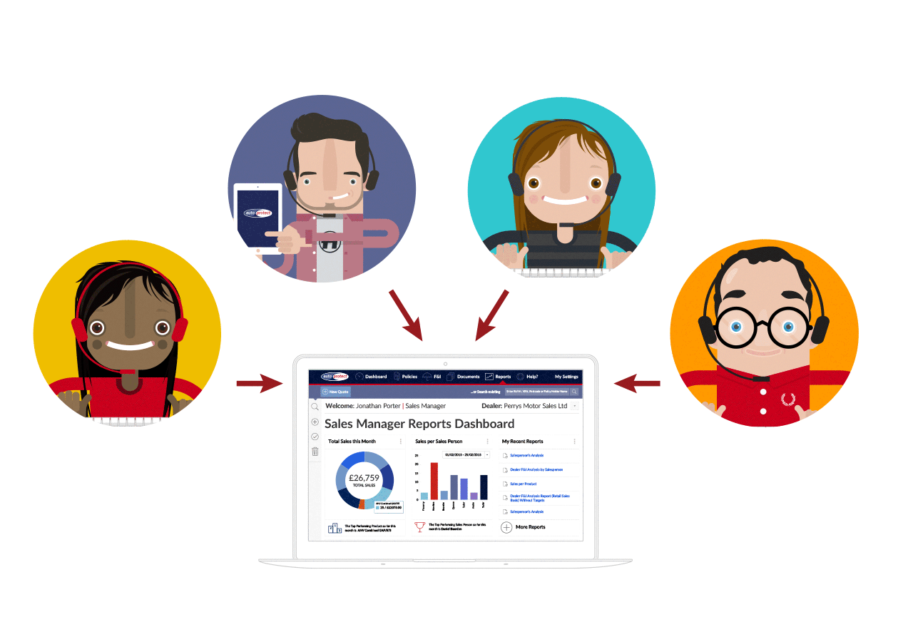
A user centred design approach was needed to understand the different types of user. Interviews and the interrogation of report logs by user type enabled us to form personas and start to prioritise goals.
“A top-tier Group Manager who might be paid on the national performance of both Finance and Insurance (F&I) products had very different needs and motivations compared to a sales person more concerned with shifting metal.”
UI Design
We used this data to prototype experiments in stripping back the UI’s functionality, only surfacing timely and relevant data determined by the user level login and context.
Marvel helped us quickly develop our rough UI sketches into interactive prototypes that we could quicky test and iterate. As we learnt more and our confidence grew, we progressed to HTML/SCSS front-ends for more realistic A/B testing and eventual system integration.
“Everyone gets presented with the entire set of reports”
Persona Interview: Group Manager
A little Ethnography
“Sitting with the app support team enabled me to listen in and watch screen sharing sessions with end users. Being at the sharp end of the customer experience can be quite enlightening!”
Jonathan Porter, Lead UX Designer
Interviews with the App Support Team and analytics data showed increasing use of AutoProcess on tablets and mobiles as dealers took the sale to the customer on the forecourt.
Impact
UCD & Agile
Integrated User Centred Design practices into the dev teams agile sprints for the first time.
Responsive
Designed and implemented the front-end of the core platform AutoProcess and client apps as fully responsive using selectve parts of Bootstrap.
Intelligent Brand Management
Modernised the UI development methodologies within the business, delivering transformational application branding capabilities by developing an intelligent Sass/SCSS front-end framework. This continues to significantly reduce both cost and time to market for onboarding new clients.
Mercedes-Benz Brand Approval
Worked directly with Mercedes-Benz to achieve brand approval of a first ever direct to consumer ecommerce product offering.
“Jonathan’s impact has really demonstrated the value of UX to the business as a whole”
Lesley coelho – IT Development Manager at AutoProtect
We thoroughly enjoyed our close relationship with AutoProtect. Working in the heart of their agile team and seeing the value of UX Design so appreciated was incredibly rewarding. To go on to help recruit and on-board the right talent for their own in-house UX discipline was equally so…
Dashboard UI – Moviegoer Analytics
Movio
Movio Webapp Dashboard UI
Movio is the global leader in marketing data analytics and campaign management software working with leading cinema exhibitors, film distributors and studios.
Movio’s mission is to revolutionize the way the film industry interacts with moviegoers.
The Brief
An analyst at 20th Century Fox wants to be able to analyse how the audience for X- men Apocalypse (defined as the Target) compares with the aggregated audience (defined as the Benchmark) of the last three movies that featured X-men i.e. Deadpool, X-Men: Days of Future Past and The Wolverine.
The analyst is interested in 5 key audience metrics:
Frequency: On average how frequently people attend the cinema each month.
Recency: The average amount of months that have elapsed since people last attended a movie.
Box Office: On average how much people spend on tickets each month.
Age: Average age of the audience.
Gender: The male/female breakdown of the audience.
The analyst is expecting to be able to view a summary comparing the Target and the Benchmark figures. The analyst is also expecting to see the key metrics broken down and charted in a logical manner, expressing the differences between the Target and Benchmark.
Geoff The Analyst
User Persona 1
Geoff is an analyst with a background in mathematics, statistics and economics. He works daily with data, primarily in the form of spreadsheets, but also has experience with more sophisticated business intelligence tools such as SAS, R, or Tableau. Geoff spends a lot of time creating data-driven reports and presentations, so is used to looking at charts and graphs. It is common for Geoff to be working on multiple projects, so Geoff finds it important to quickly identify the relevant pieces of data and determine the best way to present this data to his stake holders.
Specific user requirements:
Frequently downloads dashboard data to feed into offline activities.
Dislikes over embellished charts and insights which lack context.
Is specifically required to report to management the differences between male and female film goers within predefined age brackets i.e. above and below 30 years old.
Prefers significant insights to be delivered as natural language insights.
Product Objectives
Fast clean and simple.
User should not have to do mental arithmetic to understand the differences between the Target and Benchmark.
Browser based product optimized for desktop usage.
HP Design & Print: self-service marketing before it was a category
The client
HP wanted its printers to earn their keep beyond the office document. The proposition was simple and ahead of its time: give small businesses templates and online tools, let them customise marketing collateral in software they already owned, and print it in-house on an HP colour printer. HP's own materials from the period made the promise explicit: brochures, fliers, presentations and postcards, created without a design agency or a print shop.
We delivered this work at Agilisys between 2000 and 2005, through the Customer Experience Design department that Jonathan went on to head: a dedicated team of business analysts, user experience professionals and testers.
The challenge
Small businesses needed credible marketing materials, but professional design and print were expensive, slow and often intimidating. HP's opportunity was to make collateral creation feel accessible and guided, and to tie it to hardware customers already owned. The hard part was bridging two worlds that did not naturally connect: web-based discovery and template selection on one side, offline editing and physical printing on the other. And it all had to work for people who were emphatically not designers.
What we did
UI design and usability testing for HP's design-and-print web experience: the destination where a small-business owner browsed template categories, chose a collateral type, and was guided through to a printable result. The work sat at the intersection of template discovery, small-business brand identity, desktop publishing and printer marketing, and every one of those seams had to be invisible to the user.
Our approach
We built the information architecture around small-business tasks rather than HP's product lines, designed the interfaces for template discovery and selection, and then tested the whole journey relentlessly with the people it was for: non-designers who needed professional results without professional tools.
That testing ran in our own usability labs in Hammersmith, kitted out with the cutting-edge tools of the day: eye-tracking software, a one-way mirror for observing users, and an early interactive TV suite for demos and testing. The same lab supported a run of early interactive TV work for clients including Sky and TUI Travel. We designed within the honest constraints of the era: downloadable files, desktop publishing formats and early browsers, all shaped into a journey a busy business owner could actually finish.
Outcome
The work formed part of a wider HP move toward self-service marketing creation for small businesses, and HP kept investing in the model. It became the publicly named HP Creative Studio and HP Creative Studio for Business (the same product line), expanding internationally, including into the UK, with in-house design-and-print positioned as a clear cost saving against traditional print.
Why it still matters
This is, in effect, an early version of today's design-to-print economy. The pattern we helped shape (browse a template, customise it, print or order it) is now the default, mainstreamed by tools like Canva. Useful proof that the people behind New Brand Media were designing and lab-testing self-service design systems two decades before the category had a name.
Context & coverage
The proposition we worked on is well documented in its later public form. HP Creative Studio and HP Creative Studio for Business gave consumers and small businesses a single entry point to free templates, identity and presentation kits, royalty-free imagery and online classes, partnering names like Martha Stewart Living, Disney and DreamWorks on the consumer side and StockLayouts, iStockphoto, Corel and Intuit for small business. The pitch was explicit: create professional marketing materials in-house without hiring a design agency.
McDonald’s UK: the website that had to work like the brand
The client
McDonald's needs no introduction. From late 1999 through 2007 we were the sole digital delivery team for McDonald's UK at NetDecisions → Agilisys. That covered the main UK website, every campaign microsite, and the digital infrastructure that carried each monthly Happy Meal partnership online. The Marketing Store led the offline campaign creative and packaging; we owned everything that shipped on the web. Jonathan left Agilisys in 2007 to found New Brand Media.
Jonathan joined NetDecisions in late 1999 under John Stevens as Head of Design. As those blue-chip accounts moved properly online, the design team matured into a full Customer Experience Design department, pioneering some of the earliest web usability labs in their Hammersmith offices. Parents from McDonald's focus groups tested prototypes under eye tracking while analysts watched from behind a one-way mirror: the research kit the stakes now demanded. When John left to pursue a doctorate at Cambridge on design as a strategic tool, Jonathan took over as Head of Customer Experience Design.
The challenge
In 2000 most companies still treated the web as a sideshow. McDonald's needed the opposite. The site had to work as an extension of the marketing armoury, aligned with every offline agency and campaign. It had to build loyalty, refresh often enough to reward return visits, and hold up under very high concurrent traffic. At this scale, one weak page is a brand story, not a bug report.
What we did
We delivered art direction, design, and the technical build for the McDonald's UK website and its campaign programme. Consumer focus groups shaped the strategy from branding through to launch. Families sat at the centre: promotions, Happy Meals, company information, and community.
Almost every month brought a new Happy Meal partnership. The Marketing Store (working from Disney and other licensors) led packaging redesign and in-store creative. We built the digital half that made those promotions run. That meant competition mechanics, technical infrastructure for cup peel-offs and other in-store entry routes, and full campaign microsites where the brief needed a standalone experience.
Named work from the period includes Text-a-Monster for Disney·Pixar's Monsters, Inc., Popstars and POP & TXT, Lilo & Stitch, Finding Nemo, The Incredibles, The Muppet Show, Mac Premier, Mr Men, The Beano Online, Hot Wheels, and Barbie. We also delivered the FIFA World Cup 2002 UK microsite, including animation created for the Piccadilly Circus McDonald's screen. Several of those promotions, including POP & TXT and The Incredibles, used cup tear-off mechanics that depended on the web and SMS infrastructure we shipped.
The same account also shipped the Eat Smart information architecture, a nutrition calculator, and the Salads Plus site. That was the first digital presentation of McDonald's healthier brand story.
The delivery detail mattered as much as the design. A content management system let non-technical McDonald's staff update pages themselves. Look-and-feel stayed rigid. Performance testing was rigorous before every go-live.
Our approach
Integrated, not isolated. The site had to carry core brand values across every offline touchpoint, not chase design awards in a vacuum. Kids Zone extended each month's Happy Meal partnership onto the web, because for McDonald's the repeat visit mattered as much as the first one.
Outcome
Nearly eight years of sustained McDonald's UK web work, on an account where the client itself recognised a step change in its digital thinking:
// Client quote
“netdecisions worked well with our existing offline marketing strategy, but
brought a level of innovation to our online thinking.”
Becky Payne, Marketing Manager, McDonald’s
And from the agency side of the account:
// Account manager quote
“I have worked with Jon over the course of several years and for various
clients such as the NSPCC, CACHE and McDonald’s. His ability to deliver
outstanding creative concepts has been proven again and again.”
Amy Buckley, Account Manager, Agilisys
Context & coverage
This was the period when McDonald's was building a serious digital presence. The UK site as it looked in 2000 is preserved in the Web Design Museum. "I'm lovin' it" (2003) became its first global multichannel campaign with coordinated digital rollout. The UK web and microsite work sat at the front of that shift.
NetDecisions named McDonald's among its board-level, blue-chip clients in its July 2000 corporate brochure, alongside Marconi, Thomson Travel Group, and the AA.
McDonald’s UK history: official timeline for the UK digital relationship (built from 1999, live from 2000).