Web Design

Malts.com: the home of Diageo’s single malt distilleries

The client

Malts.com is the online home of Diageo's single malt Scotch whisky distilleries, the Classic Malts of Scotland: names such as Lagavulin, Talisker, Oban, Dalwhinnie, Glenkinchie and Cragganmore. When we took on the work, the spirits business traded as Guinness UDV (United Distillers & Vintners), Diageo's distilling arm. Behind it all sits one of the most recognisable names in drinks: Diageo.

We delivered the project at Agilisys, with Jonathan as lead designer.

The challenge

Single malt whisky is sold on heritage, place and craft. Every distillery in the portfolio has its own landscape, its own story and its own fiercely loyal following. The site had to let each one feel distinct and authentic, while holding them all together under a single premium umbrella brand that drinkers would trust.

What we did

We designed the brand identity and the website for Malts.com: a shared digital home for Diageo's single malt distilleries, from the mark itself through to the online experience.

Our approach

We designed for provenance and premium feel. Rather than flattening the distilleries into a uniform template, we gave them a shared home that let each one's character and sense of place come through, true to the Classic Malts positioning.

Outcome

Malts.com became the branded online home for Diageo's single malt distilleries, and it has endured. It remains Diageo's distilleries and distillery-tours website today, which speaks to the durability of the proposition we helped establish more than two decades ago.

Context & coverage

The Classic Malts of Scotland was Diageo's flagship single malt range, and Malts.com has remained the brand's distilleries hub through later additions such as The Singleton (launched 2006, after this work). Today the site still showcases distilleries including Lagavulin, Talisker, Oban, Dalwhinnie, Glenkinchie, Clynelish, Caol Ila and The Singleton, with distillery tours.

Text-a-Monster: interactive web for a record-breaking SMS campaign

The client

Text-a-Monster brought together three of the biggest names in entertainment and retail: McDonald's, Disney and Pixar, promoting the cinema launch of Monsters, Inc. The mobile side, delivered through 12Snap, was reported as one of the largest retail-based SMS advertising campaigns Europe had ever seen, launching in February 2002 and running across more than a thousand locations.

As the design team at NetDecisions / Agilisys, we delivered the web and interactive creative that carried the campaign online.

The challenge

Three global brands. A blockbuster film. A fixed cinema-launch deadline. And a marketing channel, SMS, that almost nobody had built a major campaign around yet. The digital creative had to look worthy of Disney·Pixar and McDonald's, and it had to connect seamlessly to a mobile mechanic that was being invented as the campaign was built.

What we did

We designed and built the full Text-a-Monster microsite at www.textamonster.co.uk: web design, interactive development and the technical SMS integration that plugged the site into the mobile campaign. The Marketing Store led the campaign (we worked closely with them across McDonald's throughout this period) and 12snap delivered the SMS. Working alongside 12snap via Disney and McDonald's, we owned the microsite and the technical campaign build end to end.

Our approach

We designed to blockbuster brand standards at campaign pace, built the experience in the interactive technology of the moment, and treated the SMS activation as the heart of the site rather than a bolt-on promotional layer. Web, interactive and mobile worked as one campaign, not three.

Outcome

The campaign ran at national scale and is still remembered as an early landmark in retail SMS marketing in Europe. It put two marquee entertainment brands, Disney and Pixar, alongside McDonald's on a genuinely pioneering mobile activation, with our microsite as the digital front door.

Why it still matters

This was mobile-first marketing before "mobile-first" was a phrase. Decades before cross-channel became standard practice, NBM's people were already blending web, interactive and mobile into a single campaign, right at the start of the SMS era.

Awards & recognition

The campaign is recognised as a landmark in early SMS marketing. It features in Campaign's "Book of Lists: the 10 best SMS campaigns", where McDonald's first SMS campaign (the Monsters, Inc. / Text-a-Monster push) is cited as the largest retail-based SMS campaign in Europe at the time.

This is recognition for the campaign as a whole, which The Marketing Store devised and 12snap delivered. Our contribution was the web and interactive build, so the credit is shared rather than ours alone.

Context & coverage

Monsters, Inc. was a genuine blockbuster (the Disney·Pixar film opened in UK cinemas in early 2002), and McDonald's ran a major Happy Meal tie-in around it. The SMS mechanic, delivered via 12Snap, was reported at the time as one of the largest retail-based SMS advertising campaigns in Europe, which is striking given how new mobile marketing was. The campaign is still cited in write-ups of early SMS marketing.

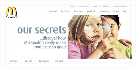
McDonalds Food Quality – Web Design and Flash Development

McDonaldsFD-WebDesign.jpg

Client: McDonalds
Agency: Agilisys
Art Direction: Jonathan Porter
Project Scope: Web Design and Flash Development

View more design for McDonald’s

WooWho: reinventing UK online dating with Wolff Olins and Branded

The client

WooWho (woowho.co.uk) was a singles dating and social portal, built as a NetDecisions joint venture with The Carphone Warehouse for 25- to 45-year-olds with no patience for tired "hearts and flowers" positioning. The promise was "zero-pressure dating": sociability first, perfection nowhere.

The brand launched on Valentine's Day 2000, in the same wave as the UK's other dot-com dating and reunion plays, but with a deliberately lighter tone, early mobile channels (web, WAP and SMS) and a B2B white-label database offer alongside the consumer product.

We led UX and art direction through our design team, and as NetDecisions / Agilisys we owned the wider build: technical implementation, hosting and venture delivery. Branded (Philip Ley) ran a brand mapping workshop; Wolff Olins delivered the identity system. This was a startup brief worked shoulder to shoulder with tier-one brand partners, not a conventional client-and-supplier arrangement.

The challenge

UK online dating was growing fast, but still culturally awkward. Sites felt like classified ads with a flirt filter. WooWho needed a credible brand and product experience that could:

  • feel social and low-pressure, not desperate;
  • work across web and early mobile (WAP, reverse-bill SMS, voicemail);
  • support distribution partnerships (including Carphone Warehouse) on a revenue-share model;
  • stand out in a market where global players such as Match.com were already established.

What we did

  • Brand strategy inputs: Branded led a full brand mapping workshop (Philip Ley, with Paul Follins) that shaped the proposition, positioning and naming direction.
  • Identity: Wolff Olins delivered the visual identity system.
  • Product and experience design: our design team owned UX and UI end to end: site structure, interaction design and art direction for the consumer experience.
  • Build and operations: as NetDecisions / Agilisys we delivered technical implementation, hosting and venture operations around that experience.

Our approach

Strategy before pixels. The Branded workshop nailed down what WooWho stood for and how it laddered from product attributes to brand essence before a single screen was designed. That discipline stuck: it is a direct ancestor of the Brand Map methodology New Brand Media uses to structure brand strategy work today.

Collaboration at the top of the market. Wolff Olins shaped the identity; our team translated it into a usable, likeable product surface; and we shipped a multi-channel dating venture in the first UK dot-com wave, not a brochure site.

Channels as product. Dating was never desktop-only here: subscription, reverse-bill SMS and voicemail sat alongside the web experience, with distribution partners on a typical 50:50 revenue share.

Outcome

By September 2002, WooWho had 37,000 registered members, and Match.com was reported to be finalising a deal with NetDecisions to take woowho.co.uk and woowho.com, migrate members ("a safe harbour" for the community, in Match.com's words) and redirect traffic to its own service. Joe Cohen, Match.com international vice-president, confirmed it as a commercial agreement with NetDecisions.

WooWho did not endure as a standalone brand, but it sits in a strong line of NetDecisions ventures from the same era (TheFirstResort, madaboutwine, produxion.com): early UX leadership on a category-defining brief, delivered alongside Wolff Olins and Branded.

Why it still matters

WooWho is an early example of product UX at venture pace with tier-one brand partners, years before "dating app fatigue" was a phrase anyone used. And the Branded brand mapping workshop still echoes in how NBM structures brand strategy work today.

Context & coverage

  • Match.com tipped to buy rival's assets (Campaign, 25 September 2002): 37,000 members; 85% NetDecisions ownership; Valentine's Day 2000 launch; Match.com domain and member migration.
  • Zyra archive: woowho.co.uk: period tagline for zero-pressure dating, 25–45 age group.
  • NetDecisions capability brochure (July 2000, ingested in repo): woowho.co.uk as a Digital Ventures JV with Carphone Warehouse; web, WAP, SMS; B2B white-label.

British Gas: putting a household name online

The client

British Gas, part of Centrica, is one of the most recognised household names in the UK. As the web became a mainstream service channel, the brand needed to carry that everyday trust into a digital experience its customers could rely on.

We delivered this work as the design team at NetDecisions / Agilisys. It began with British Gas's first online presence in the NetDecisions years from 1999, with the "House in Order" web work following in the Agilisys era.

The challenge

A utility serving millions of homes cannot treat the web as a brochure. British Gas needed an online presence that was clear, dependable and genuinely usable for a very broad, non-technical public, one that matched the reliability people expected from the service itself.

What we did

We designed and built web experiences for British Gas, including the "House in Order" work. Our job was to give a mass-market household brand a credible, usable home on the early web, at a time when few brands of this scale had one.

Our approach

We designed for the broadest possible audience: plain language, dependable interactions and navigation anyone could follow. This was the period when large consumer brands were defining what "being online" even meant for a utility, and every decision had to earn the trust the brand already held offline.

Outcome

The work helped establish British Gas online during the formative years of the web, giving one of the UK's most trusted household names a digital presence built to the same standard as the service behind it.

Context & coverage

British Gas was in the middle of a major reinvention at the time. The old business had demerged in 1997, and the consumer arm under Centrica was diversifying hard: it launched the Goldfish credit card and bought The AA in July 1999 for around 1.1 billion pounds, all while the dot-com era pushed every household brand to establish itself online. Putting British Gas on the web sat squarely in that push to turn a utility into a broader consumer-services brand.

Company No. 06323071
VAT 915941805
+44 560 366 0374
Keep in touch